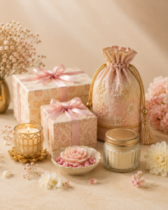
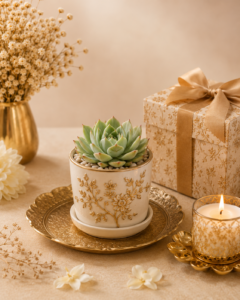
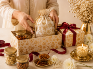
Ivory, burgundy and antique gold carry heritage warmth without tipping into excess. The combination photographs well, suits both day and evening events, and keeps a large celebration feeling coordinated.
Let ivory do the heavy lifting
Use ivory as the dominant surface across packaging, sleeves and stationery. It keeps the palette calm and makes the other two colours read as deliberate accents rather than competing tones.
Burgundy for depth, gold for detail
Burgundy works best in larger blocks such as ribbons, boxes and textiles. Reserve antique gold for the smallest elements: monograms, tag edges, seals and foil text.
Carry it across every touchpoint
Apply the same three colours to invitations, welcome signage, table styling and the return gift itself. Repetition is what makes a palette feel intentional.